Ambient Lighting Colors Reviews | CarInteriorMix
Ambient Lighting Colors Reviews: What Do You Think?
Ambient lighting is one of those car interior upgrades that feels small? until you live with it for a week. Then suddenly you?re noticing it every night drive, every early morning start, every time you open the door and the cabin ?welcomes? you. And if we?re being honest, it?s also one of the fastest ways to make an interior feel modern?or, depending on the color choice, a little too ?gaming PC.?
That?s where the real fun starts: color opinions. We all have them. Some of us want a classy, OEM-plus vibe. Others want something bold that screams personality. And then there are the practical folks who just want lighting that doesn?t distract or reflect on the windshield. So let?s talk about it like we would in the comments section or in a parking lot after a meet: what colors work, what colors don?t, and why we disagree so passionately about it.
Below are a few popular ambient lighting color ?camps? we see all the time in the car interior community?along with the pros, cons, and who each one tends to work best for. Jump in with your own take as we go.
1) Ice Blue / Cool Cyan: ?The Modern Tech Look?
Why people love it: Cool blues and cyans feel crisp and futuristic. They?re a go-to for anyone chasing that clean ?new car? vibe, especially in cabins with black trim, brushed metal accents, or minimalist dashboards.
Pros:
- Looks modern and sharp?great for clean builds
- Pairs nicely with silver/metal interior accents
- Often reads ?OEM? if brightness is kept low
Cons:
- Can feel cold or sterile if the cabin already feels dark
- Some setups reflect more on glossy trim or windows
- If it?s too bright, it can feel like a ?club light? fast
Best for: Drivers who want a sleek, modern interior and don?t want the lighting to steal the show.
Community voice: ?I set mine to a soft cyan at like 20% brightness. Looks factory. But my buddy cranked his to 100% and it?s basically a spaceship in there.?
2) Warm Amber / Orange: ?The OEM+ Classic?
Why people love it: Amber is the comfort food of ambient lighting. It feels cozy, premium, and familiar?like older BMW/European-style illumination, or the warm glow of classic gauge clusters.
Pros:
- Easier on the eyes at night?less harsh
- Feels upscale and ?intentional?
- Plays well with tan interiors, wood trim, and warm leather tones
Cons:
- Not as ?flashy? for those who want a statement
- Can look dated if the LED quality is weak or uneven
- May clash with cool white screens if everything else is blue-toned
Best for: Anyone who wants understated luxury and long-drive comfort.
Community voice: ?Amber is the only color I don?t get tired of. Blue looks cool for a month, then I?m over it. Amber just works.?
3) Red: ?The Sporty Mood (and the Most Debated)?
Why people love it: Red lighting feels performance-focused, like a cockpit. It can also be a vibe?especially if the rest of the interior has red stitching, calipers, or accents.
Pros:
- Sporty, aggressive, and driver-focused
- Pairs well with red stitching and carbon-style trim
- Can feel less distracting when kept subtle
Cons:
- This is where debates get heated: ?too intense? vs ?perfect vibe?
- Some reds look cheap if the LED is overly pink or uneven
- Can feel visually heavy in small cabins
Best for: Sporty builds and anyone who wants the cabin to feel like a night-time performance lounge.
Community voice: ?I love red, but only in the footwells and door pockets. Full red strips across the dash? That?s where it starts feeling like a warning light.?
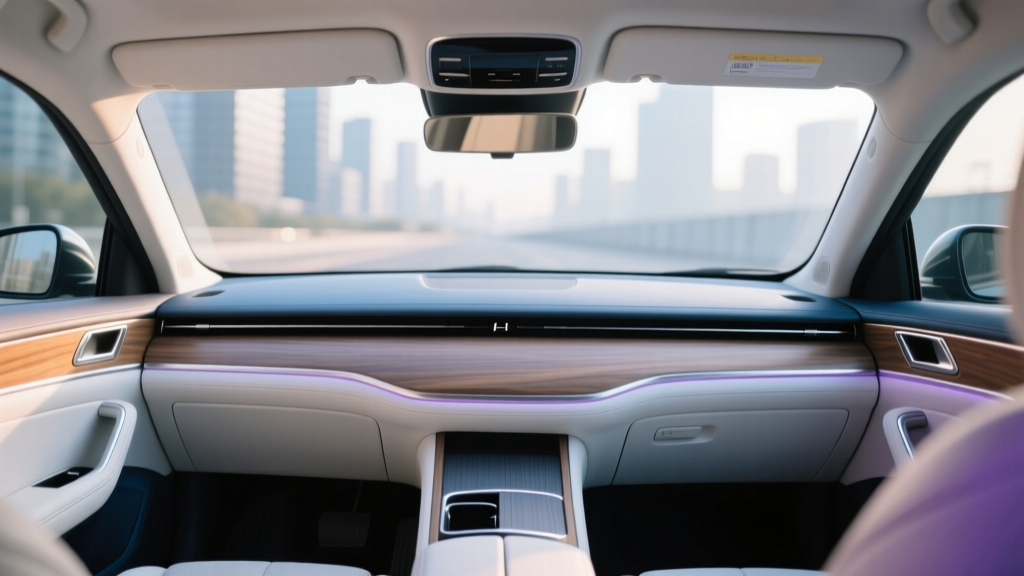
4) Purple / Magenta: ?The Custom Show Look?
Why people love it: Purple sits right in that sweet spot between chill and bold. It?s not as common as blue or red, so it can feel unique without being chaotic.
Pros:
- Stands out?great for meets and photos
- Looks awesome with black interiors and tinted windows
- Can shift from classy to wild depending on brightness
Cons:
- Some setups skew too pink and lose the ?premium? feel
- Not everyone loves it for daily driving
- Can clash with certain infotainment screen themes
Best for: People who like customizing their cabin mood and want something different from the usual suspects.
5) Pure White: ?Clean, Minimal, and Risky?
Why people love it: White lighting looks clean, bright, and straightforward?especially in modern interiors. When done right, it can look like it came straight from the factory design studio.
Pros:
- Minimalist, crisp, and matches everything
- Great for showcasing interior details and textures
- Works well with any exterior color theme
Cons:
- Can be distracting if it?s too bright (windshield reflections are real)
- Shows uneven diffusion more than colored lighting
- In some cabins, it can feel more ?utility? than ?mood?
Best for: Clean builds, daily drivers, and anyone who wants simple and functional?just keep it dim.
Quick Poll: Where Do We Land?
If we had to pick one ?default? ambient color for our cars, what are we choosing?
- A) Ice Blue / Cyan
- B) Warm Amber / Orange
- C) Red
- D) Purple / Magenta
- E) Pure White
- F) ?It depends??I change it based on mood/weather/music
Let?s Stir the Pot (Friendly Edition): Discussion Prompts
- Are we team ?OEM look? or team ?make it obvious??
- What color do you love in photos but hate in real life while driving?
- Do you keep the brightness low and subtle, or do you want it to pop?
- What?s your biggest ambient lighting pet peeve: hot spots, glare, mismatched tones, or cheap-looking LEDs?
Now it?s your turn. Drop your ambient lighting color choice in the comments?and if you?ve changed your mind over time, tell us what made you switch. Bonus points if you share your interior color, trim style (piano black, brushed metal, carbon look, wood), and whether your setup is factory ambient lighting or an aftermarket kit.
So what do we think: which ambient lighting color feels the most ?right? in a car?and which one is the most overrated?